See “Nat Geo Year in Review”
What is it?
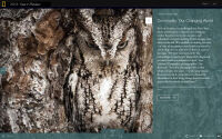
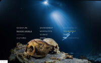
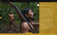
This multimedia web experience includes more than a hundred of National Geographic’s most surprising stories from 2013.
What problem does it solve?
As a user, I don’t know how to find the best content from National Geographic’s many brands.
Year in Review 2013 combined all of Nat Geo’s identities into one.
What was my role in it?
I worked with Dana Fraser to produce this feature. We solicited, organized, and edited submissions from many different groups at Nat Geo to make a holistic view of our large organization.
Jody Sugrue and Kate LaRue designed the feature and crafted a lot of its multimedia sensibility, working with Pam Chen and Mike Schmidt. Many of us dove into the scripts and stylesheets to get this live in time, but Chris Moore did a lot of the heavy lifting, as did Joel Fiser. Amy Bucci helped with many launch issues over the holidays.
How does it work?
The site is static HTML and JavaScript, built using much of the existing “Serengeti Lion” codebase. It uses HTML5 video.
Backstory
We were constrained by the need to use an existing design and codebase without making major changes. This was a serious tradeoff: the site doesn’t work on mobile, and it is difficult to navigate back to each source story as a user of the site. But we were able to spend more time focusing on the content and less on the technology as a result of this decision.
It drew many visitors, and they spent a lot of time engaging with the site. We considered it a successful brand play.


